Deriving a Bitcoin Blockspace Demand Curve
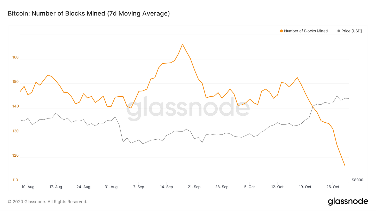
This week’s dramatic decrease in hashpower (close to -20%) has lead to something of a natural experiment occurring in the blockspace market: a bonafide negative supply shock.
When hashpower decreases it takes miners longer to produce blocks so fewer are produced and less blockspace is available for transactions.

See the number of blocks mined drop off a cliff. Source: Glassnode.
Blockspace supply is generally inelastic. The protocol adjusts difficulty so that blocks arrive at a target frequency. Blocksize is capped at 1vMB and since miners race to produce blocks there is no incentive to withold supply to get a better price as this will just hurt the individual miner.
If I were to put my intro to microeconomics skills to use I might draw simple supply/demand diagram for Blockspace like this:

A simple blockspace supply/demand model.
Since Blockspace supply is fixed in this model it is represented by a vertical line at the target quantity determined by the protocol. Blockspace demand is represented by the downward sloping blue line as it is responsive to price. The red circle where they meet is the equilibrium price where amount demanded equals the fixed supply.
If demand for blockspace were to increase, it might look like this:

An increase in blockspace price due to an increase in demand.
The demand curve shifts “up” to the right (increase in quantity demanded) and since supply is fixed the equilibrium price shifts up. The amount that the price moves is determined by the slope of the demand curve. When this happens we can’t really observe the demand curve because price is just shifted up along the vertical supply line.
Alternatively, and as was the somewhat special case this week, the blockspace price can increase from a reduction in supply. Such a case would look like this:

An increase in blockspace price due to an decrease in supply.
When supply of blockspace is reduced (and demand stays the same) we move along the blockspace demand curve to a new equilibrium. In this case we can observe the demand curve (within the range of prices seen) and actually measure it’s slope!
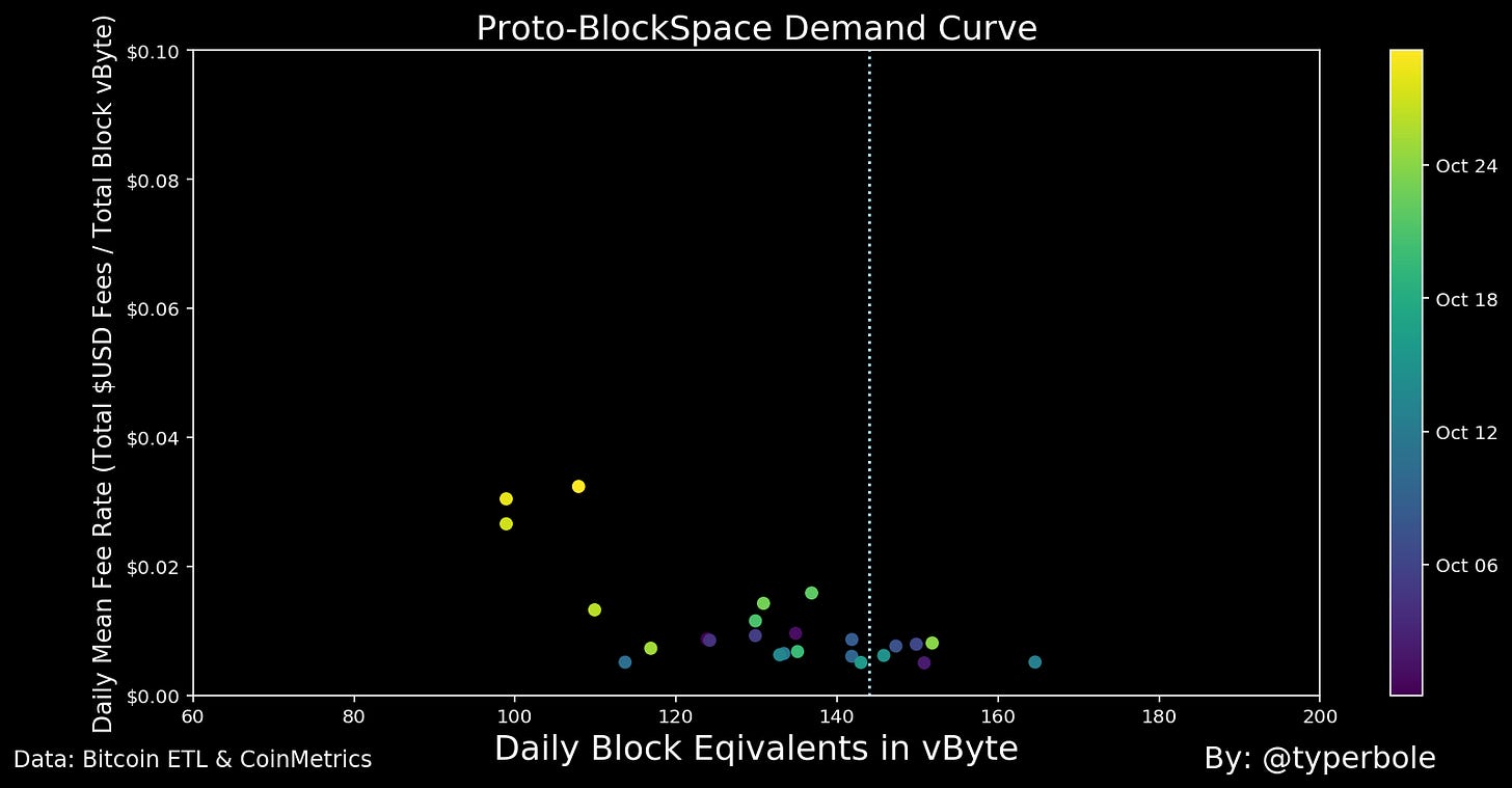
And since such a supply shock happened recently we can actually try to plot the scatterplot of blockspace quantity vs blockspace price to see if an incipient blockspace demand curve emerges. Here is my attempt to do this:

Are we seeing a blockspace demand curve here? Maybe! Small sample, but the directionality is correct. The vertical blue line represents the typical expected supply of 144 blocks per day. Data: Bitcoin ETL & CoinMetrics.
This case study has a bunch of caveats (noted below), but I wanted to share my initial result as a fun experiment for those of us interested in the emergence of a strong market for blockspace. There does seem to be a negative slope to demand which is encouraging! When I started this exercise I thought I would just get a random blob of points.
I’m interested if anyone else has suggestions of more precise ways to derive the demand curve. If so let me know.
Notes & caveats:
Chart shows the daily block equivalents in vBytes of blockspace vs the daily mean fee rate in $USD per block vByte
I only included data for October 2020 to try to keep to a period where demand was relatively constant
That being said obviously demand has fluctuated within the month of October so this isn’t perfect - there are definitely going to be some demand effects present in this scatter
I filtered the scatterplot and only included days where the blockspace price was above $0.005 per vByte. My reasoning here is that I only want to include days where blockspace demand was sufficient to fill blocks and lead to market based rationing of blockspace.
